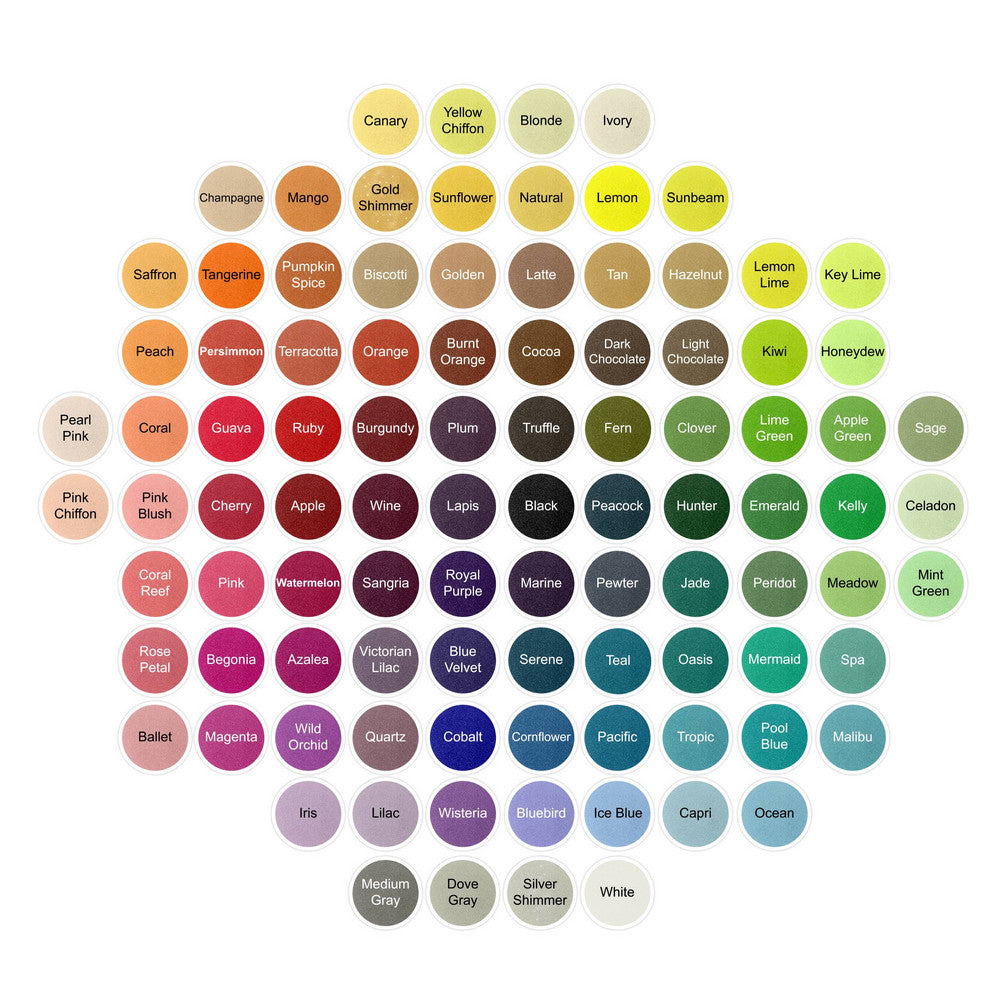
Pantone's Spring 2015 color picks are a beautiful blend of soft, earthy tones. Cool blues and understated brights along with neutrals give this palate a soothing feel as the warmer months approach. We've offered up our closest sand matches to some of these colors.
Aquamarine: A beautiful, airy blue color with a bit of grayness to it.
Our matches: It falls between
Ocean (a little more blue) and
Serene (a bit darker)
Scuba Blue: One of the more vibrant colors. A fun, bright turquoise
Our match:
Malibu. Give the tropical ocean feel, and also compares to David's Bridal Malibu
Lucite Green: Refreshing minty green - almost like sea glass
Our match:
Tiffany blue. A little bit more blue and lighter.
Mint Green may also be a good comparison to this color.
Classic Blue: A strong blue that pairs well with many other colors
Our match:
Marine. A classic navy that can almost act as a neutral in your color palate.
Toasted Almond: A neutral with a hint of a red undertone that gives it warmth
Our match:
Golden - a warm, organic neutral
Strawberry Ice: A flattering and sweet pink shade
Our match:
Rose Petal - perfect for a pink and gold theme
Tangerine: Fun, bright, and energizing
Our match:
Tangerine - compares to David's Bridal Tangerine
Marsala: The 2015 color of the year is a rich winey red with a brown undertone. Bold & robust
Our match:
Apple or
Wine. Wine will be a bit more purple, and apple will give you the rich, deep red color you want
Glacier Gray: Timeless and relaxing neutral that will compliment most other colors perfectly
Our match:
Dove Gray - perfect to pair with almost anything
Lavender Herb: The only purple shade on the list. A fun and unexpected pop of color
Our match:
Wisteria. A nostalgic shade of purple that is perfect for spring
Woodbine: A yellow green that could be called nature's green
Our match:
Fern. The color of foliage, grass, and growing plants
What is your favorite of Pantone's spring colors?


 Pantone's Spring 2015 color picks are a beautiful blend of soft, earthy tones. Cool blues and understated brights along with neutrals give this palate a soothing feel as the warmer months approach. We've offered up our closest sand matches to some of these colors.


← Older Post Newer Post →